This is my final animation. I used the song L.O.V.E. by Nat King Cole because I figured it fit the commercial perfectly. I found this project to be the most difficult but it was also a lot of fun making the animation and seeing how everything is put together. With no background in how to do an animation I'm very pleased with how this animation turned out.
Monday, April 23, 2012
Final Animation
This is my final animation. I used the song L.O.V.E. by Nat King Cole because I figured it fit the commercial perfectly. I found this project to be the most difficult but it was also a lot of fun making the animation and seeing how everything is put together. With no background in how to do an animation I'm very pleased with how this animation turned out.
Monday, April 16, 2012
Screenshot Animation
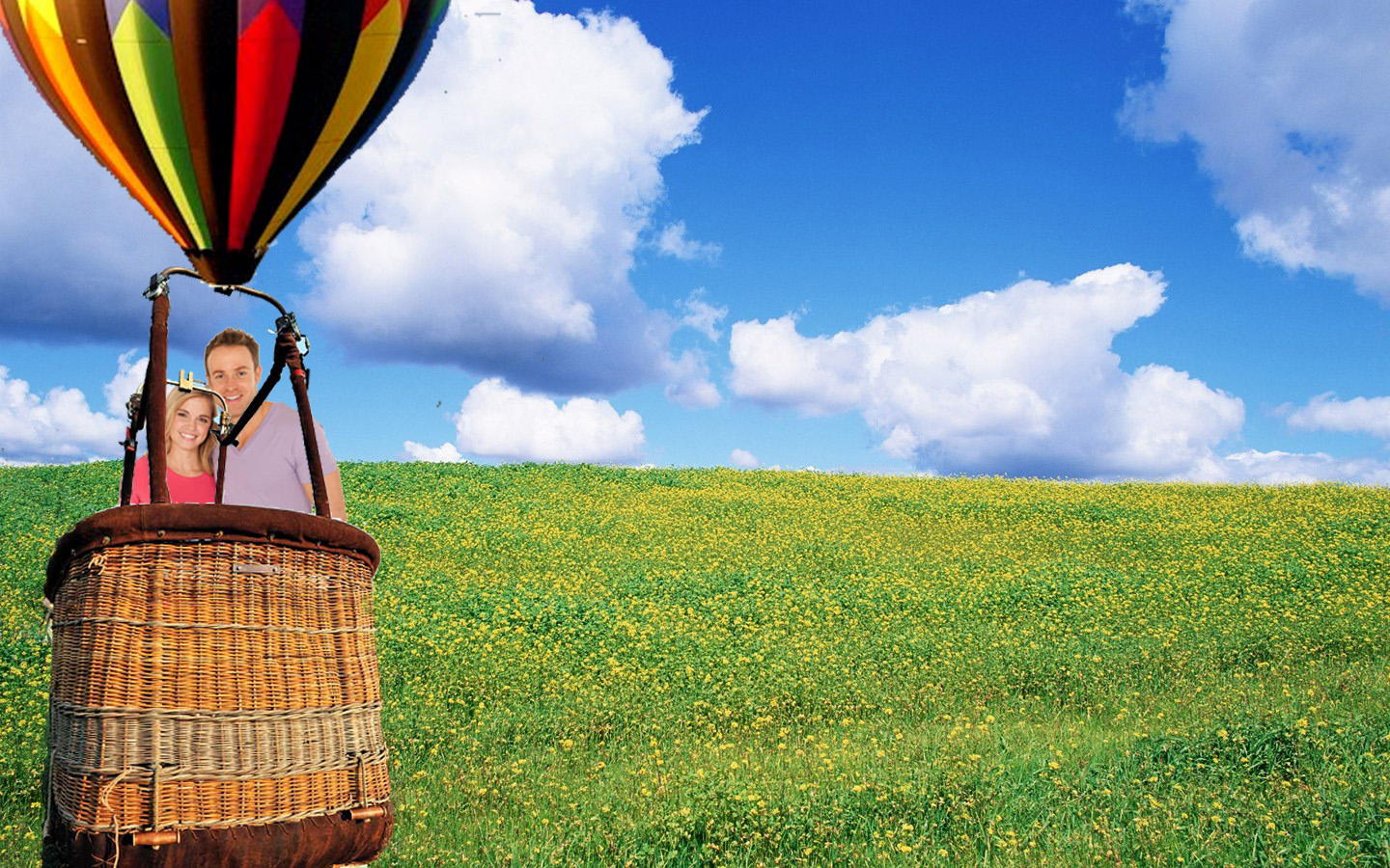
This is the first screen shot of my animation. I'm going to show the couple floating up into the air and change the background to the Tampa skyline. I might make the balloon bigger in this scene but I really wanted to show the couple in the balloon, so that way you could see them. This will be the first scene of my commercial.
Monday, April 9, 2012

Wednesday, April 4, 2012
5 Commercial Ideas
1. My first idea is to have a hot air balloon floating from the ground and going up into the sky and then when it reaches the top of the sky, the balloon will pop and the next screen will show the "Champagne Dreams" logo.
2. My second idea is where a couple is sitting down drinking a bottle of the champagne dreams champagne and then it does a flashback to when the couple was in the air balloon and then flashes forward to the couple smiling. The last scene is the "Champagne Dreams" logo.
3. My third idea is showing a family sitting at home thinking of an idea for vacation and then it flashes to the hot air balloon scene. I want the hot air balloons really known instead of the champagne in this commercial because I think the hot air balloon is more family friendly. I would still show the logo at the end though.
4. My fourth idea is like the 2nd idea except it's an old couple, and they flash back to their hot air balloon experience except their experience is shown when the company first started so clothing and things on people might be a bit different. I still want the logo in the last scene and I still like the flash back and flash forward effect.
5. My fifth idea is really showing the champagne bottle, maybe showing the champagne bottle oozing over the glasses and really showing how great the champagne is.
Tuesday, April 3, 2012
Commercial Evaluations
1. http://www.youtube.com/watch?v=FPPk81kBSR4
M&M Superbowl Commercial
What is the visual style of the film (animated, live action, stop motion)?
Live Action and Animation, they use real people but also the M&M animations
What is the tone (happy, sad, scary, funny)?
Funny, I think this commercial is really funny and I think other people thought so too.
What is the product they're selling?
M&Ms
Who is their Target Audience?
Anyone, probably more adults so that way they can understand the joke and more adults tend to watch the superbowl but anyone can eat M&Ms.
What is the 'problem' that the product is solving?
I don't think there is a 'problem' they are trying to solve in this commercial, they just want to sell their product in a lighthearted funny commercial
How does the commercial talk about these problems?
Again, I do not think they are solving a problem.
Is there a Narrator? If so, is the narrator a voice over (off screen) or a character on screen?
There is a voice for the brown M&M and the red M&M but all other voices are the human actors/actresses and it is a voiceover.
Do you feel that the commercial is successful? Why?
Yes, I think this commercial is really successful, it is funny and gets the product they are trying to sell across in a short and timely manner and it keeps the viewer engaged because this commercial is funny.
2. http://www.youtube.com/watch?v=mS_fc5XVjkc
Gap Kids Christmas Commercial
What is the visual style of the film (animated, live action, stop motion)?
Live action, there are kids singing and dancing
What is the tone (happy, sad, scary, funny)?
This commercial is meant to be happy however, I find it extremely annoying and I can't stand the commercial.
What is the product they're selling?
Gap Kids Clothing
Who is their Target Audience?
Parents and young girls.
What is the 'problem' that the product is solving?
This commercial does not solve any problems either, however the problem about the commercial is that the song the girls sing is annoying and there is screaming the background. I just think it is obnoxious and to overdone.
How does the commercial talk about these problems?
Again, there are no problems they are trying to solve.
Is there a Narrator? If so, is the narrator a voice over (off screen) or a character on screen?
There is no narrator.
Do you feel that the commercial is successful? Why?
No, I don't think this commercial. It is obnoxious and to overdone and the song they sing is annoying. Along with the screaming in the background. I just find this commercial annoying and when I see it, i want to turn it off.
3. http://www.youtube.com/watch?v=BZJ1KVMLjpo
Chevron Gas Commercial
What is the visual style of the film (animated, live action, stop motion)?
Animated
What is the tone (happy, sad, scary, funny)?
I think this commercial tries to stay happy but also informative.
What is the product they're selling?
Chevron Gas.
Who is their Target Audience?
Anyone who drives a car.
What is the 'problem' that the product is solving?
They are trying to make their gas sound like it is the best for a persons car.
How does the commercial talk about these problems?
They talk about where the gas comes from and how how happy they are with their gas.
Is there a Narrator? If so, is the narrator a voice over (off screen) or a character on screen?
Yes, an offscreen narrator.
Do you feel that the commercial is successful? Why?
I think this commercial is successful, it came out in 1979 and I think for its time it is really successful and gets the point across.
4. http://www.youtube.com/watch?v=LamtBiGLzI8
Apple iPhone Commercial
What is the visual style of the film (animated, live action, stop motion)?
Live action
What is the tone (happy, sad, scary, funny)?
Happy and content
What is the product they're selling?
Apple iPhone
Who is their Target Audience?
Anyone, primarily adults.
What is the 'problem' that the product is solving?
They are showing how much they can do on their iPhones and how great they are.
How does the commercial talk about these problems?
It talks about how the iPhone easily solves all the problems and hassles.
Is there a Narrator? If so, is the narrator a voice over (off screen) or a character on screen?
Yes, there is an offscreen narrator.
Do you feel that the commercial is successful? Why?
Yes, I think this commercial is successful, because I have an iPhone and a majority of people I know have an iPhone as well. I think this commercial shows that people would be lost without their iPhone.
5. http://www.youtube.com/watch?v=umczO5Y5Av0
Fancy Feast Proposal Commercial
What is the visual style of the film (animated, live action, stop motion)?
Live action
What is the tone (happy, sad, scary, funny)?
Happy and heart warming
What is the product they're selling?
Fancy Feast Cat Food
Who is their Target Audience?
Anyone with a cat
What is the 'problem' that the product is solving?
They are not solving a problem is this commercial.
How does the commercial talk about these problems?
There is no problem in this commercial.
Is there a Narrator? If so, is the narrator a voice over (off screen) or a character on screen?
There is no narrator, just background music.
Do you feel that the commercial is successful? Why?
I personally love this commercial. I think it is cute and heart warming. They put a lot of thought into it and I think the commercial is very successful and makes the audience happy as well.
Wednesday, March 28, 2012
Updated Brochure


This is my updated brochure. I got rid of the orphans and added a mailing letter to the back. Also, I added a table for the price lists which I like. I also added another photo.
Wednesday, March 21, 2012
Brochure Corporate Idenity


Updated Business Card and Letter Head


For the business card, I just justified all the fonts at the bottom and made the "logo" font of "Champagne Dreams" bigger at the top.
I am starting to like these designs a lot better.
Monday, March 19, 2012
Business Card Updated Design


This is my updated business card design. I changed the colors and I like it better than the first time I did it. I made everything centered in the middle for the information and the the logo font bigger.
Letterhead

This is my letter head for the Champagne Dreams company. I changed the background color to the light green and did a gradient mesh to it. I used a gold font as suggested in class so that way it would all match the champagne bottle. I'm not sure if I like the colors just yet but I tried to use a green that was light but bright enough so you could see it. I think the gold font works though because it matches the champagne bottle. I'm going to change the business card to match these. But I think the colors work better with the champagne bottle now.
Thursday, March 15, 2012
Business Card Design


The top picture is the front of the business card and the bottom picture is the back of the business card. I changed my color scheme to the pink and blue because I thought it was happier and would attract more customers because of the colors. I kept the signature design on the front with the Champagne Dreams champagne bottle design. I kept the font of the logo the same as well except for changing the color of the font to the blue. I know in class we had talked about doing the bottle on one side and the logo on the other but I thought that the back of the card was starting to get too busy with all the information on it. I like how the card turned out. I would still like to fix up the champagne bottle a little bit but I was having a lot of trouble when I was moving the bottle in and out of illustrator without the bottle looking too fumbled. I think the business card came out well though and I like the color. For the pink/light background I used a gradient mesh tool and took the line across in a diagonal so it looked like the pink was fading. For the other information I used the font "Century Gothic" because I thought it was easy to read and I still used the same font color as the logo font color. I am pleased with how this turned out and hopefully next class I can learn how to make the champagne bottle look better.
Tuesday, March 13, 2012
Business Card Sketches


These are some sketches for my business card logo design. I liked my original 'Champagne Dreams' logo design so I kind of want to keep that same affect for the front. Expect I want to clean up the logo better because now I feel like I am better with illustrator and photoshop to be able to make the original logo look cleaner and the edges more shaped to look like a champagne bottle. I still like the color scheme I had except to make the Champagne Dreams font color a bit more darker I think so that way more people are drawn to it. I had a few different designs displaying the company name and my name and the phone, fax, website, e-mail and address a bit different so I have a few different options I can choose from. I think my favorite one is the 4th one. The vertical one on the 1st page. I think I still want to keep the business card simple though with simple fonts and the logo not too bold but just enough to be noticed.
Wednesday, February 29, 2012
ART 210 Business Questionnaire
1) What is your business?
Champagne Dreams. We take people for a hot air balloon ride and when their ride is over, they get a free signature bottle of champagne.
2) Describe your business in one sentence
As stated before... we talk people for rides in hot balloons and at the end of their journey, they receive a free bottle of signature champagne.
3) Who is your target audience?
Primarily couples, if the couple is under 21 years of age we will give them a signature sparkling cider bottle. We also will take business groups and just anyone who would like to go up in a hot air balloon.
4) Who are your competitors?
Other hot air balloon businesses, even though we give away a signature bottle of champagne, I think other champagne companies might be competition as well.
5) What makes them better/worse than your product/service?
I think that other places might be better than us because they have been in the business longer so that might draw more people's attention. But, we do offer the signature bottle of champagne for people and give our customers an amazing experience up in the air that they will never forget. They could be worse because they might not give anything back to the customer and they might not have such an enjoyable up in the air experience as we give.
I think that other places might be better than us because they have been in the business longer so that might draw more people's attention. But, we do offer the signature bottle of champagne for people and give our customers an amazing experience up in the air that they will never forget. They could be worse because they might not give anything back to the customer and they might not have such an enjoyable up in the air experience as we give.
6) Do you currently have an identity? (This is more for companies that are already established and you’re just revamping the logo/corporate identity. If you have a new company or product, skip this question.)
Yes, the company already has a logo, it can be find below on this blog. It is a champagne bottle with sparklers coming out with the "Champagne Dreams" logo. I want to revamp the logo with maybe the font and make curvier edges on the champagne bottle. I still want to keep the signature logo though, "Champagne Dreams" basis themselves a lot on tradition so I want to keep the classic style.
Yes, the company already has a logo, it can be find below on this blog. It is a champagne bottle with sparklers coming out with the "Champagne Dreams" logo. I want to revamp the logo with maybe the font and make curvier edges on the champagne bottle. I still want to keep the signature logo though, "Champagne Dreams" basis themselves a lot on tradition so I want to keep the classic style.
7) (If your answer to #6 is no, skip this question) What do you like about it and what don’t you like about it?
As stated above, I like the traditional look of the logo, it is simple but gives the logo some character, I want maybe change up the font and colors, make the champagne bottle edges curvier. I would also add in a small hot air balloon maybe next to the "C' for "Champagne Dreams" I think I would need to sketch up more designs and look at it again.
As stated above, I like the traditional look of the logo, it is simple but gives the logo some character, I want maybe change up the font and colors, make the champagne bottle edges curvier. I would also add in a small hot air balloon maybe next to the "C' for "Champagne Dreams" I think I would need to sketch up more designs and look at it again.
8) How do you want your image to be seen in two years?
I want the company to really launch off in two years, expand our locations throughout more cities and allow more people to really experience being in a hot air balloon with still getting that classic and traditional feel of enjoying champagne.
These following questions might seem silly, but their purpose is to help generate ideas.
9) If your company was an animal, what animal would it be and why?
I think my company animal would be a bird, like maybe a huge seagull or something. Bird's fly in the air, and hot air balloons take you up in the air so I think it would be that the company was about going up into the air.
10) If your company/brand was a person, who would it be and why?
Joseph Black, the man who invented the hot air balloon. I think this would be significant because I did some research and champagne "flights" have been around for many of years. So this would show that our company stays true to tradition if it dates back to the man who invented the hot air balloon.
11) If your company/brand was an object, what would it be?
A champagne bottle or a balloon?
12) If your customer was a cartoon character, who would it be?
I would probably do a hot air balloon guy with a smile on his face. Simple, but it gets the point across that it is a hot air balloon company and that he is happy about the company.
Wednesday, February 22, 2012
Lyrical Collage

Wednesday, February 15, 2012
Photoshop Location Photo

Hey everyone! I'm in Ireland!! Just kidding, but I did place a photo of myself in front of Malahide Castle in Ireland. I always thought it would be cool to be able to tour real castles and see how the "royal" people used to live back in the day. I used my regular images except I cropped out the background of the photo of myself and scaled it down smaller to make it look like the castle is a lot bigger. I also put a shadow behind myself to make the photo look realistic. My photo of myself was taken outside and the castle is outside so I feel like both images worked well. This was my first time working with photoshop and I'm realizing I actually like it and could possibly be good at doing something with it. I would like to become more familiar with photoshop to see what I can create next!
These are my original photos:


Sunday, February 12, 2012
Complex Illustration

This is my Complex Illustration, I really like how the orange turned out however I did have some trouble with the limes. I found it really difficult using the mesh tool to try to get the colors to come out just perfectly. I would try to add more lines with the mesh tool but then all the other colors kept becoming more confusing so I tried to keep it simple but I also wanted to show the distinct color values of the limes. I think I could improve this by becoming more familiar with the mesh tool and then going back to add more color value but I didn't want it to become to confusing for this assignment.
This is the original picture:

Wednesday, February 1, 2012
ART 210: Final Logo

Sunday, January 29, 2012
My Calligramme

Tuesday, January 24, 2012
ART 210 Logo Part 3 Sketches

These are 5 of my sketch ideas for my logo. Logo number 4 and 5 got cut off by my scanner but I have the original drawings on paper. My favorite logo is #3.
Monday, January 23, 2012
ART 210: Assignment 2 Logo Critiques

I like the Pita Pit logo design however I think the colors could be better. Pita Pit is a food chain where a lot of college students and younger crowds go for lunch or dinner. I like the font of their logo because it is bold and gets the viewers attention. However, I like the font underneath their name logo because I think it's a fun font. I think the colors could be something brighter to get more people's attention. The primary red and boring green color doesn't do the logo much justice. I think if maybe they did a bright blue and mixed it with the red or some other colors besides the red, white and green. I think the colors take away from the logo.
I love the pinkberry logo. I think it is fresh and clean but the font shows that they have a cute design. I like the pink swirl in front of the pinkberry name. I think that the pinkberry logo does bring in customers because it is cute but also looks professional. The pink swirl does not take away from the name but gives the logo an added touch to make it stand out.

I used Betsey Johnson's logo because I came up with my JR Handbags idea as one of my logos. I love Betsey Johnson's logo because I think it describes her perfectly. The font is perfect because the buyer can still read it but it's also an edgy font which fits Betsey Johnson's style. Also, the Betsey Johnson lips at the end of the logo is her signature thing and she puts it on a lot of her bags. The pink font works well with Betsey Johnson's personality because she uses fun and bright colors in a lot of her designers and she tends to work with pink a lot. I love her logo and think it works well for her signature and unique style.
4. Tumblr
Tumblr is an online blogging website which I use frequently so I thought it would be perfect to write about. On tumblr you can blog anything, pictures, music, videos, and etc. However, I do not like the tumblr logo. Although it is an online blogging site and should be clean and easy to read I think the logo could look better. I like the font for this logo but I feel like it needs an image or a design next to it to make it stand out and be well known. There is nothing on the logo besides the name and the navy blue background is boring and dull and does not make the tumblr name stand out at all. I think maybe they could have picked a black background or another color that would really make the white font stand out.

5. Keller Williams
I like the Keller Williams Realty logo. I really like the cursive KW on top of the red bold Keller Williams name. The KW adds a signature and classy look to the logo. Also, the red, bold font really stands out and catches a viewers attention. The font is easy to read so that way it can catch anyones attention. I think this logo does well for the Keller Williams business and I think it would bring in a lot of clients.
Sunday, January 22, 2012
COM 210 Project 1: Logo Part 1
My 5 fictional business companies are as follows:
1. Sprinkles
Sprinkles is a bakery which will sell cupcakes, cakes, cookies, and just about any bakery item someone can think of. I think this idea because recently I've been getting into watching the show Cake Boss and I think it would be neat if Sprinkles was the same kind of concept. Sprinkles will bake any kind of custom cake and is known for their individuality and uniqueness in their baked goods.
2. JR Handbags .
JR Handbags will be a business named after myself. I've always been interested in fashion and interested in designing my own handbags but I want these handbags to be comprised of fun colors and uniqueness. JR Handbags will sell handbags that make a person really stand out and represent the Betsey Johnson type of style.
3. Staging Real Estate Company
Staging Real Estate Company helps with furnishing and decorating homes that are for sale.
4. Couture Kitties
Couture Kitties specializes in selling pure bred cats and kittens. Kittens are rag dolls, Persians, siamese and all other pure bred cats and kittens a person could think of. They also sell cat accessories as well such a scratching posts, beds and toys.
5. Aroma Longue
Aroma Longue is an ultra contemporary place where people can go to enjoy coffee and tea of all flavors. They make fresh baked desserts and also have board games that customers can play while they enjoy their beverages/desserts.
6. Champagne Dreams
Champagne Dreams is a hot air balloon company where people can be brought up in hot air balloons. People can be taken up and view all sites of the location where they choose to go up. People will enjoy an amazing experience and also get a collectable bottle of champagne for each visit up in the hot air balloon.
Wednesday, January 18, 2012
COM 210 Assisment 1
Hey!!
I'm Jill Rosenblum, I'm a sophomore at the University of Tampa and majoring in advertising and public relations.
I'm in a sorority on campus, Kappa Alpha Theta. I also am the event chair for UT Spotlight PR and I'm the assistant coordinator for the advertising and public relations section on The Minaret.
Although I do not have a strong artistic background, I expect to learn a lot about how to make really cool art projects on the computer. I know this class might be a bit of a challenge for me but, I'm hoping that I'll learn more about possibly how to create ads and how to create different types of art using the computer.
I'm excited to start this class and start learning more about digital arts!
-- Jill Rosenblum
Subscribe to:
Posts (Atom)